


Mixing patterns can feel a little like walking into a paint store without a plan: overwhelming at first, but so fun once you have a few rules to lean on.
The good news? You don’t need a design degree to create a layered, interesting pattern mix. You just need a starting point, a loose color story, and a little confidence to keep going.
Today, we’re walking through a plain living room and building it one layer at a time. You’ll see how each added piece brings more personality, color, and depth to the room without making it feel random or overly busy.
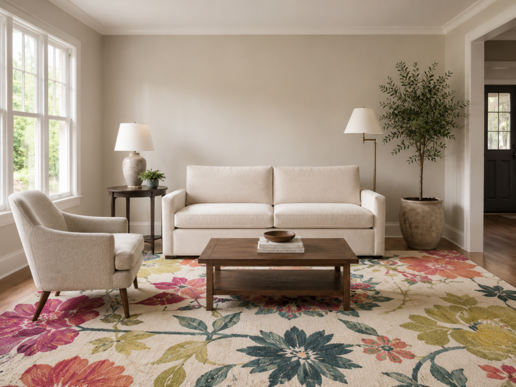
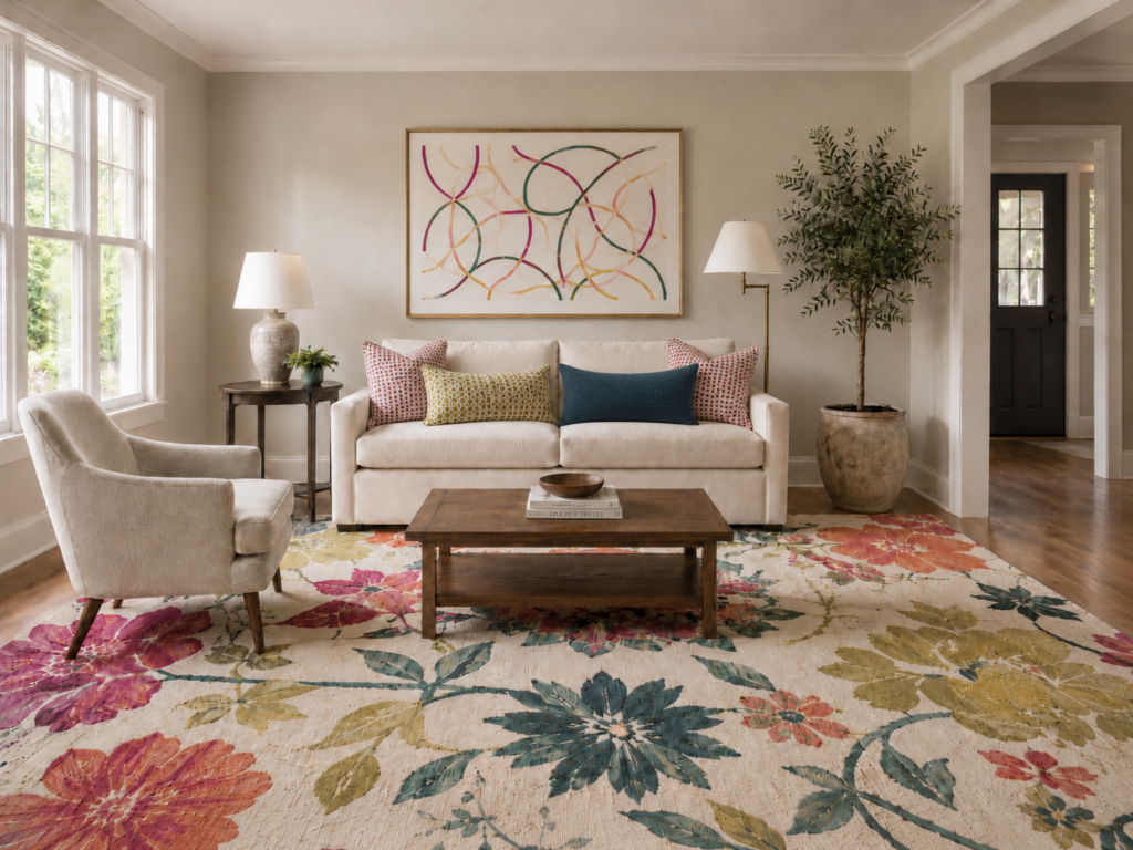
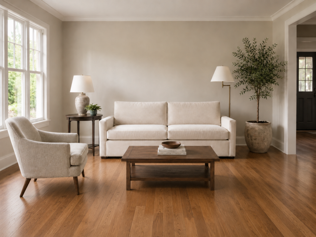
This room starts with a pretty neutral base: warm wood floors, soft beige walls, white trim, a cream sofa, a neutral chair, wood tables, lamps, and greenery. It’s calm, classic, and totally livable.
But it’s also a little quiet.
This is where pattern and color can completely change the personality of a room.
Step 1: Start with One Anchor Pattern
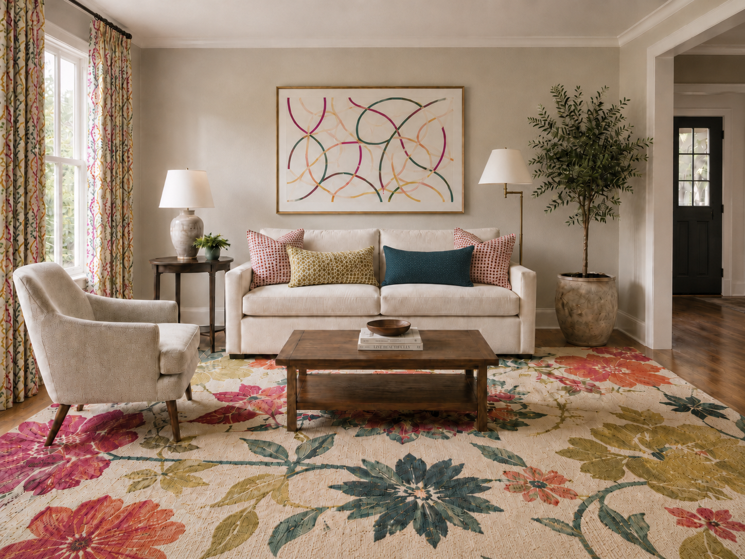
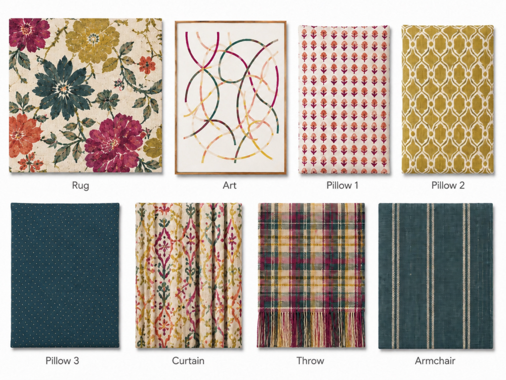
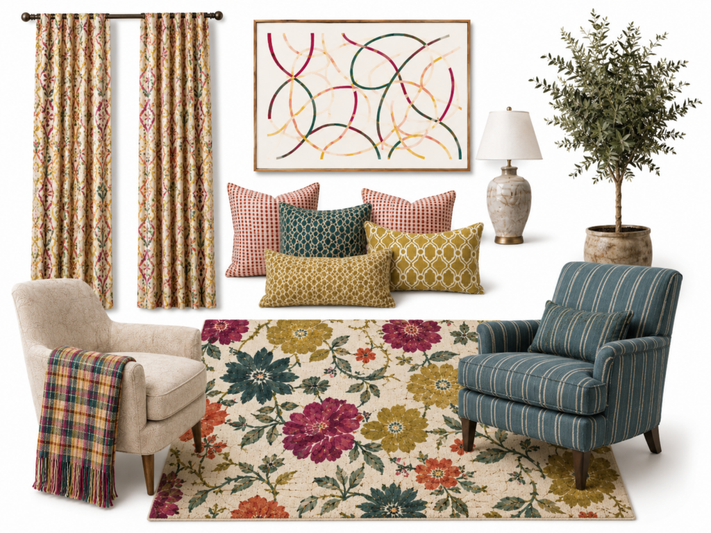
The first piece we added is the rug, and this is doing a lot of the heavy lifting.
When you’re mixing patterns, it helps to start with one anchor pattern. This is usually the largest-scale pattern in the room and often includes multiple colors. A rug is a perfect place to start because it covers a large area and instantly gives you a color palette to work from.
In this room, the floral rug introduces cream, teal, coral, berry, olive, and golden tones. Instead of guessing what colors to add next, we can pull directly from the rug.
The rug becomes the “home base” for the rest of the room. It tells us what colors feel connected and gives the room a clear direction.
*Designer Tip: If you’re not sure what counts as a large-scale pattern, it’s usually the pattern you notice first from across the room.
Step 2: Add Artwork That Repeats the Color Story
Next, we added artwork above the sofa.
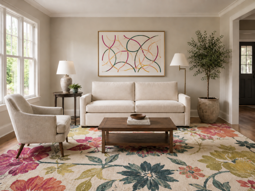
The art doesn’t match the rug exactly, and that’s the point. Matching too closely can make a room feel flat or overly coordinated. Instead, the art repeats several colors from the rug in a completely different pattern style.
The rug is floral and organic. The art is abstract and linear. Because the colors relate, the two pieces feel like they belong together. Because the pattern types are different, the room feels more layered and interesting.
This is one of the easiest ways to mix patterns well: keep a common thread, but change the pattern type.
Florals and abstract linework can absolutely work together when the colors are speaking the same language.
Step 3: Bring in Smaller-Scale Patterns
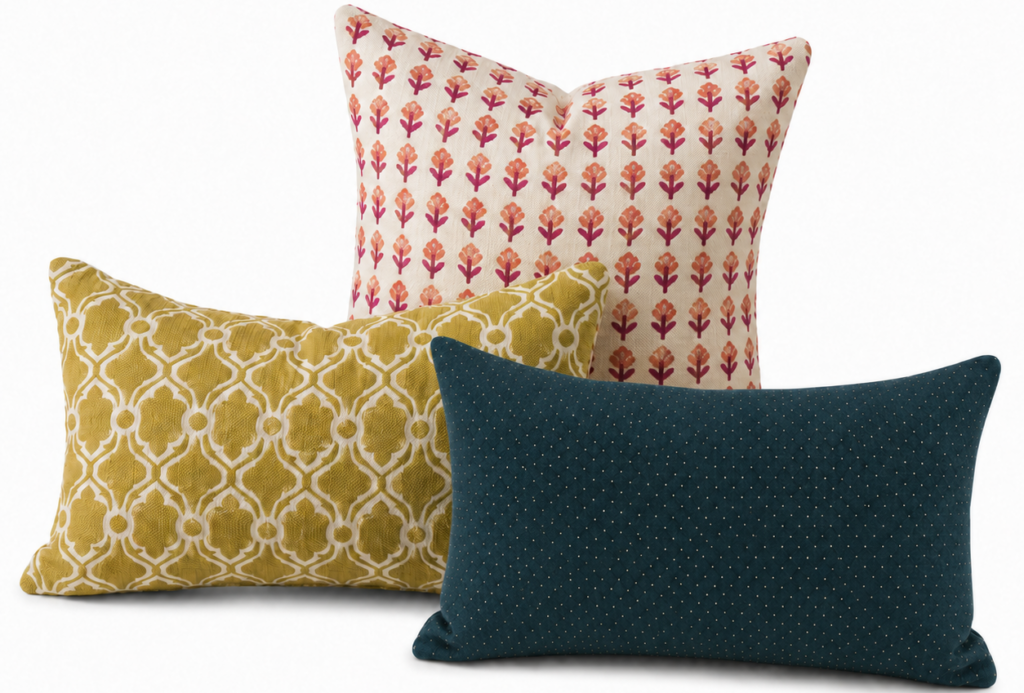
Once the larger pieces are in place, pillows are a great way to add smaller-scale patterns.
The pillows pull colors from the rug and artwork, but each one brings something different to the mix:
- The coral pillow has a small repeating print.
- The golden pillow has a medium-scale geometric pattern.
- The dark teal pillow reads almost like a solid from far away, but up close it has a tiny dotted detail.
This is where the room starts to feel styled instead of simply furnished.
A helpful way to think about pattern scale:
Large scale = the wow
Medium scale = the support
Small scale = the texture and detail
The key is to avoid using several patterns that are the same size and same style. If everything is equally bold, your eye doesn’t know where to land. By varying the scale, each pattern has its own role.
This vignette is a great example of how patterns can live together without fighting. The floral rug is large and colorful, the art is loose and linear, the pillow patterns are smaller and more repetitive, and the nearly-solid teal pillow gives the eye a place to rest.
Step 4: Add Pattern Vertically with Curtains
Curtains are another opportunity to add pattern, and they can make a huge difference because they bring the color story up off the floor and onto the walls.

In this room, the curtain fabric relates to the rug without copying it. It has a similar warm cream background and repeats some of the same coral, berry, olive, and teal tones, but the pattern itself feels more structured and vertical. That vertical movement helps frame the windows and makes the room feel more finished.
This is also a good reminder that patterns don’t have to be used only in pillows. Drapery, Roman shades, upholstery, wallpaper, lampshades, bedding, and rugs can all be part of the mix.
If you’re pattern-shy, start small with pillows or a throw. If you’re ready for more impact, curtains or a rug can completely transform the feel of a space.
Step 5: Use Solids and Textures as Breathing Room
Now we added a plaid throw to the chair.
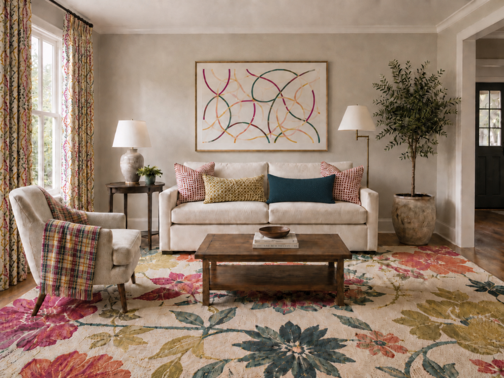
At first, plaid might sound like “one more pattern,” and technically it is. But because it’s used in a smaller dose and shares colors with the rest of the room, it feels intentional.
This is where texture and material matter. The throw feels cozy, casual, and woven, which works with the soft, layered feeling of the room. It doesn’t feel too shiny, formal, or out of place.
One of the biggest secrets to mixing patterns is giving your eyes somewhere to rest. In this room, the cream sofa, neutral chair, wood tables, plain walls, and nearly-solid teal pillow all help calm the busier patterns. That balance is what keeps a colorful, patterned room from feeling chaotic.
Not everything has to be patterned. In fact, the pattern works better because there are quieter pieces around it.
Step 6: Add One More Statement Piece
The final layer is the blue striped armchair.
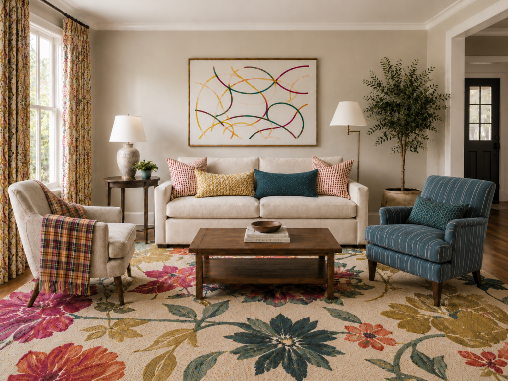
This is a bolder move, but it works because the chair repeats the teal-blue tones already introduced in the rug, art, and pillows. The stripe is also a different pattern type from everything else in the room.
At this point, we have florals, abstract linework, small block prints, geometric pillows, plaid, dots, curtain pattern, and stripes. That sounds like a lot on paper, but in the room it feels connected because the colors repeat and the scale changes from piece to piece.
This is the difference between matching and coordinating. Matching says, “Everything came from the same set.” Coordinating says, “These pieces were collected thoughtfully.” Coordinating almost always feels more personal, more layered, and more designer.
When you see the pieces pulled together in a product vignette, the relationship becomes even clearer. Each item has its own personality, but they all share a common color story and a similar level of warmth and softness.
A Simple Pattern-Mixing Formula
If you want an easy structure to follow, try this:
- 1 large-scale pattern: your anchor, such as a rug, wallpaper, or bold drapery
- 1 medium-scale pattern: something that supports the anchor
- 1 small-scale pattern: a tighter repeat or subtle detail
- 1–2 solids or textures: pieces that give the room breathing room
Bonus points if you keep at least one element consistent across the mix, such as color family, mood, or contrast level.
In this room, the common thread is color. The patterns don’t all match, but they repeat similar tones: teal, coral, berry, olive, gold, and cream.
Pattern Types That Work Well Together
If you’re not sure where to start, try mixing different types of patterns instead of using several versions of the same one.
Some combinations that usually work well:
- Florals with geometrics
- Plaids with stripes
- Polka dots with organic prints
- Traditional patterns with modern linework
- Small repeats with oversized statement patterns
If two patterns are the same scale and the same style, they’ll usually compete. If they’re different in either scale or style, they’ll usually play much nicer together.
Don’t Forget the Mood of the Materials
Patterns don’t live in a vacuum. Fabric type, texture, and finish matter too.
A shiny silk print has a totally different mood than a chunky woven plaid. A crisp tailored stripe feels different than a faded block print. None of these are wrong, but they need to make sense together.
For this room, the overall mood is warm, casual, colorful, and collected. The rug has a handmade feeling. The pillows are soft and approachable. The curtains feel decorative but not overly formal. The throw adds cozy texture. The striped chair brings in structure without feeling stiff.
That shared material mood helps the room feel cohesive.
The Before and After

This is the power of pattern and color.
The room started as a pretty, neutral space. Nothing was “wrong” with it, but it didn’t say much yet. By layering in a colorful rug, coordinating art, patterned pillows, curtains, a throw, and a statement chair, the room suddenly has personality.
It feels warmer…More collected…More custom…More alive.
And that’s the whole point. The goal isn’t perfection. It’s personality.
When patterns share a common thread and you mix scale, style, and texture intentionally, your space can feel layered and interesting without feeling overwhelming. Coordinated beats matching every time.
Want more designer tips and newsletters straight to your inbox?


leave a comment